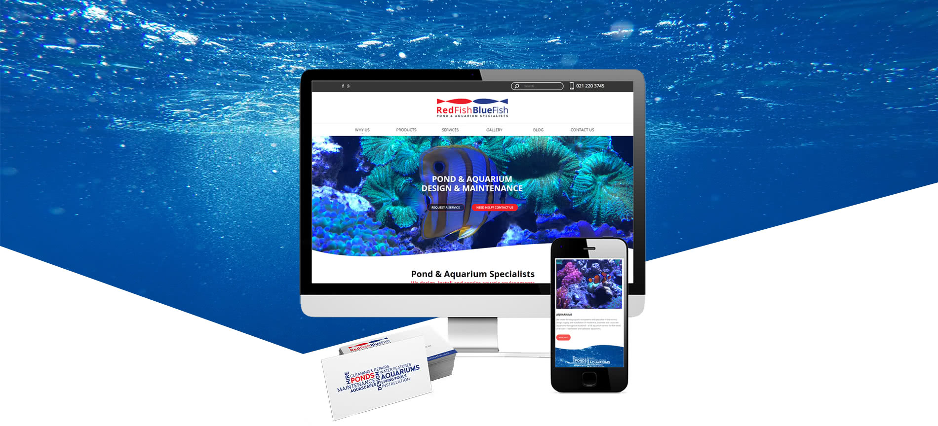

A REFRESHED LOOK
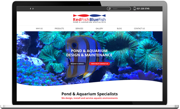
One of our long-time clients changed ownership. The new owner is passionate about the quality of work RedFish BlueFish offers. He was equally happy with the enquiries the old website was bringing in but wanted a modern look with more of a focus on ponds and the importance of creating viable aquatic ecosystems rather than just installing fish tanks.
GETTING NOTICED
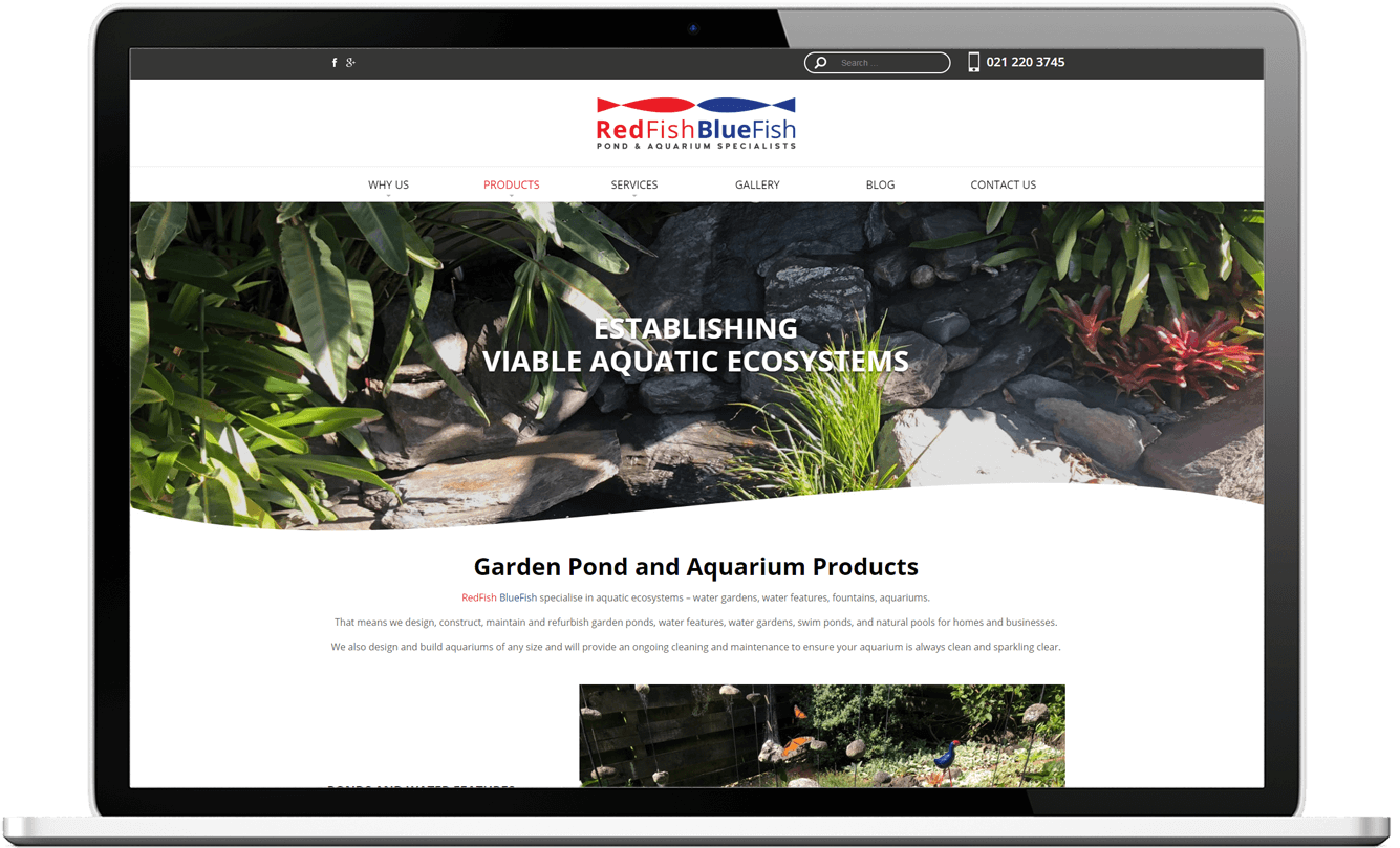
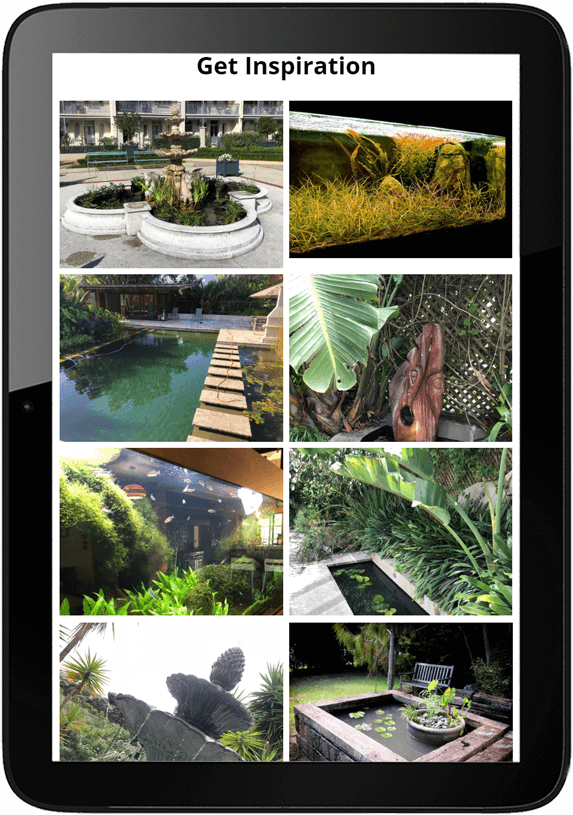
A refreshed look for the website allows for larger photos showcasing the visually
appealing products and space to flesh out the broader range of services on offer. And new text written by Web Revolution helps to reflect the passion and knowledge the new owner has for his industry. Just a few days after going live, the new website has already created a buzz.
“Big shout out to you and your team! Great work on the website! I’m starting to get the first positive comments about it from customers and prospects.
Thanks a lot for the cake! One of the best chocolate cakes we have tasted here in NZ, and that’s coming from a Belgian! ;)”
Arne
BEFORE:
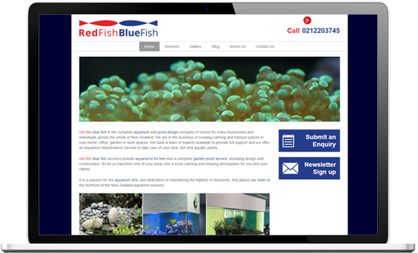
AFTER:
BUSINESS CARDS THAT TALK
Business cards were designed for the new owner to be clean and simple for readability and to clearly communicate what RedFish BlueFish do no matter which side of the card is presented. Basic contact details are all that is needed for customers and prospects to get in touch.


New flyers generating new business
New double-sided DLE flyers were designed to further promote the business in retail stores, garden shows & special events. Enquiries began almost immediately, with the first call coming in the Monday following their weekend debut.


