
LIGHT & BRIGHT WEBSITE
FOR A FAMILY FRIENDLY PRACTICE
You Only Get One Chance to Make a Great First Impression!
First impressions are exactly what Anthea and her team of interior designers offer their clients at Homebase Stage Style & Interiors. And we specialise in creating great first impressions online for our clients, so we were excited to help Homebase do just that.
If you are interested in making a great first online impression, contact us today.
MODERN & INVITING
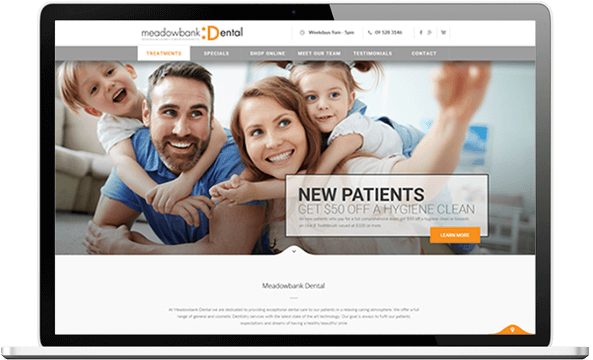
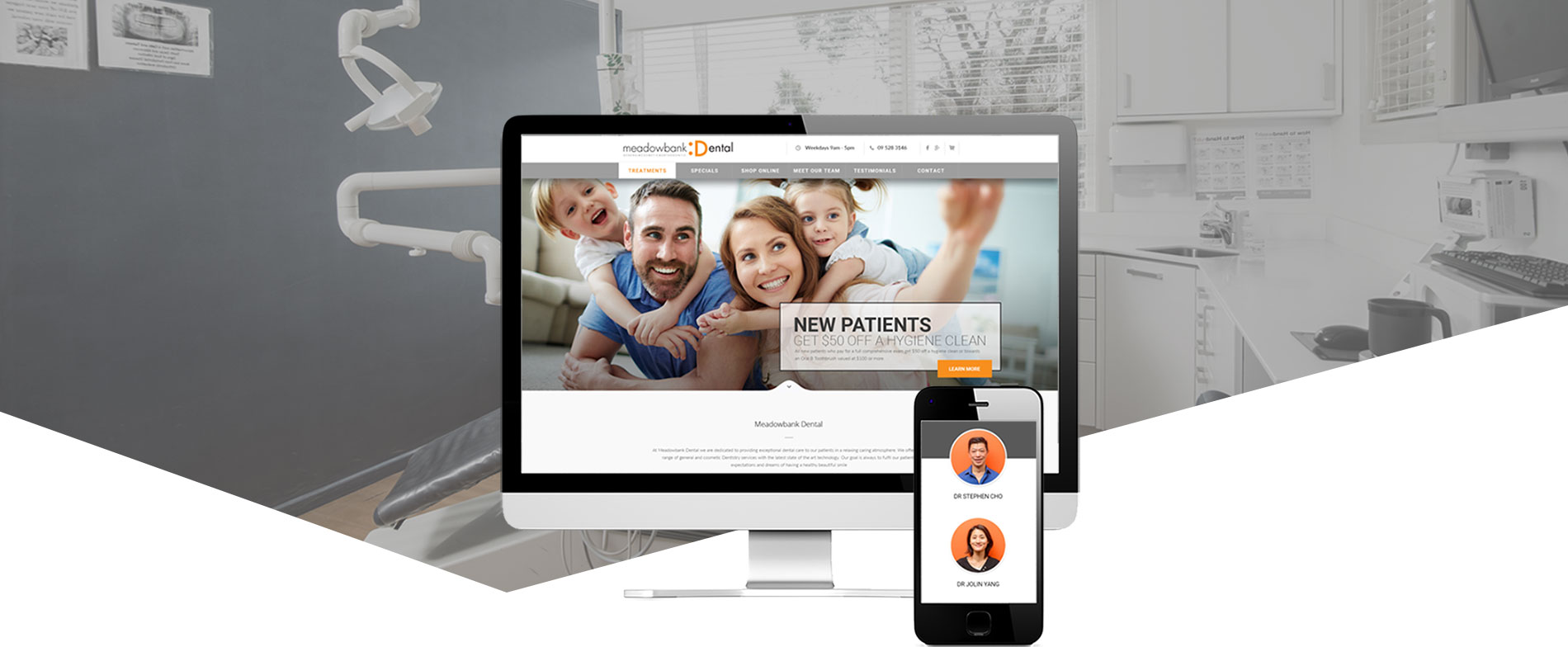
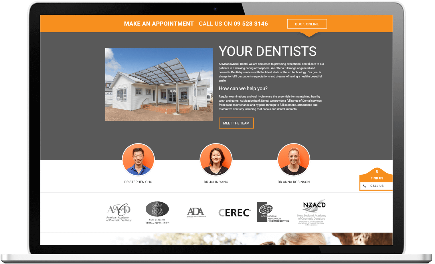
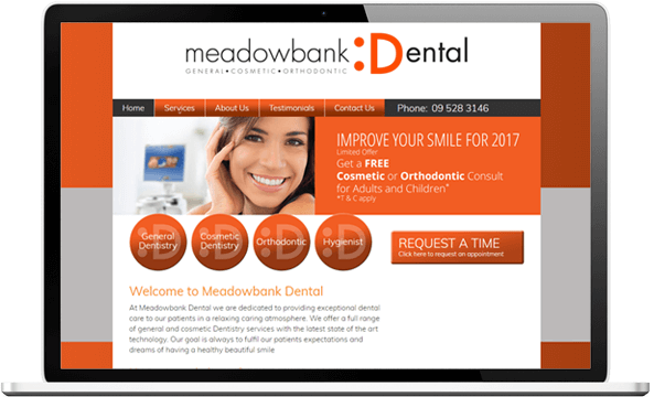
Meadowbank Dental Centre is a modern and inviting practice but their old website felt heavy and impersonal. By lighting things up, adding more open space, including photos of the dental team, making use of the full real estate available to highlight unique selling points and promotions we have created an online experience that more accurately reflects the relaxed environment of the physical practice.
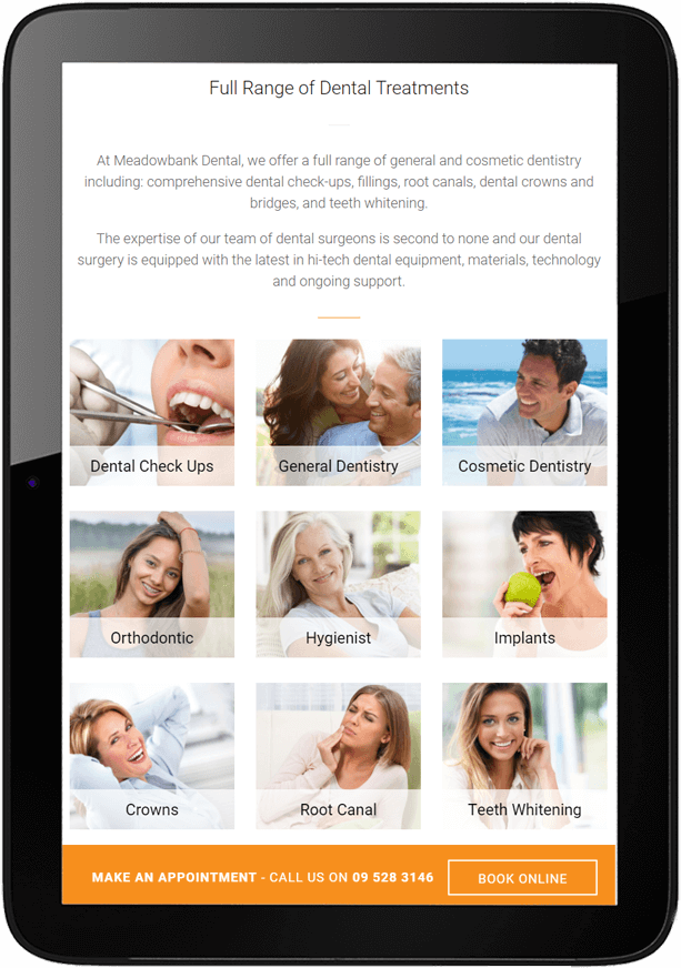
The website helps present important information clearly. Details that visitors will be looking for, such as opening hours and contact information, are located at the top of every page of the website. In addition, quick contact forms on every page help people to easily covert no matter which page of the website they enter on
GETTING CLICKS
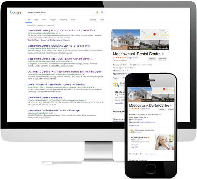
Web Revolution provides a combination of local search engine optimisation work and seasonal AdWords campaigns to keep Meadowbank enquiries coming in. Constant tweaking of campaigns to narrow the target and keep promotions at the forefront.
BEFORE:
AFTER:
