AN EWE LOOK FOR A NEW OWNER
When our client purchased Forever Ewe, along with the fun and quirky animal sculptures came a frilly pink brand and very outdated website. Our brief was to update the brand and website to better reflect their place in the market as providers of quality, artistically designed garden sculptures.
We are proud of the result which is a clear representation of what Forever Ewe has to offer.
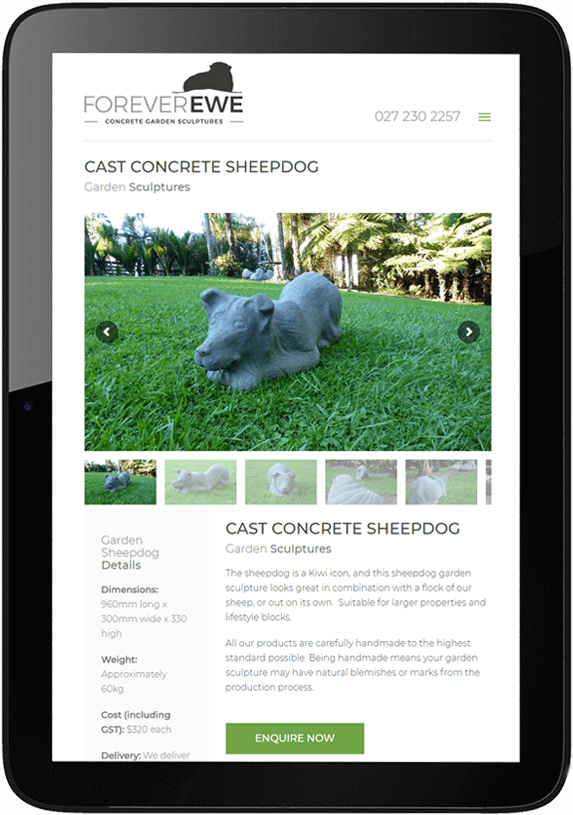
A CLEAN NEW WEBSITE
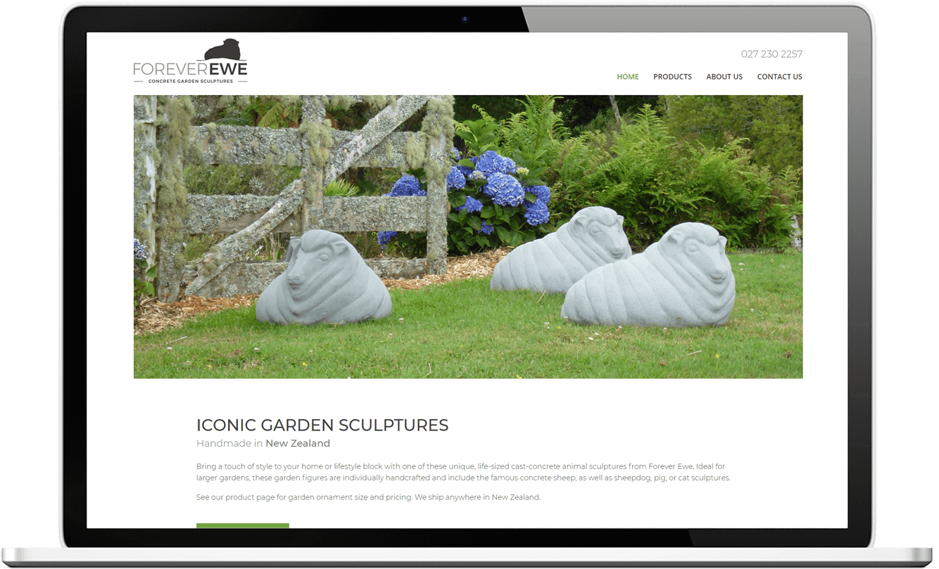
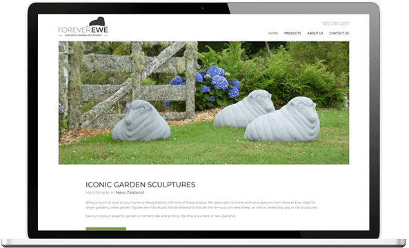
When re-designing the website, modern simplicity was key.
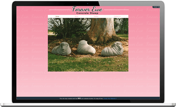
The pink background texture was out and vibrant photos, descriptive text and white space were in. We’ve added several strategically located points of contact and detailed product descriptions so that potential buyers have all they need to make an informed purchasing decision.
WEBSITE BEFORE:
WEBSITE AFTER:
LOGO BEFORE:

MODERNISING AN OLD LOGO
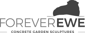
The client asked for clean, simple lines and a recognisable image to represent the featured product that inspired their name. Shades of grey reflect the medium used to create the final products and selective use of bright grass green set the scene for the sculptures.
In addition, we adjusted the tagline to reveal the wider range of products available.
LOGO AFTER:

PRIMARY COLOUR #1
DARK GREY
CMYK : C67.19 M60.16 Y58.98 K45.7
RGB : R66 G66 B66
Web : #424242
PRIMARY COLOUR #2
CONCRETE
CMYK : C53.91 M45.7 Y45.31 K10.55
RGB : R121 G121 B121
Web : #231f20
SECONDARY COLOUR
GRASS GREEN
CMYK : C67.19 M60.16 Y58.98 K45.7
RGB : R110 G165 B66
Web : #6ba542
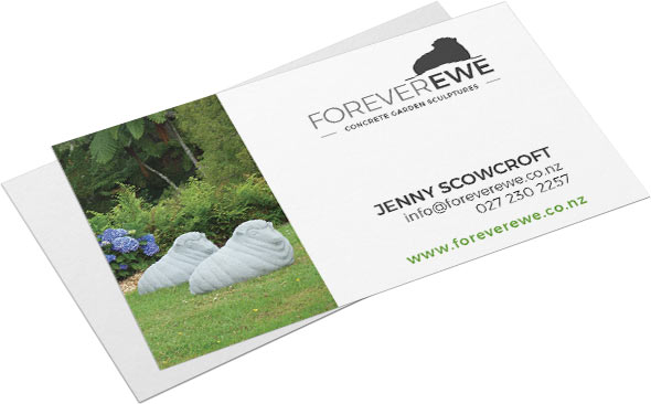
LEAVING A GREAT IMPRESSION
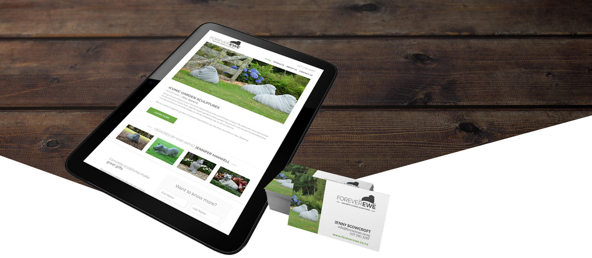
Business cards were designed with generous white space in keeping with the clean, simple style of the new website. The use of photos ensures that it is clear what Forever Ewe provides. on first glance.
