An all around new look
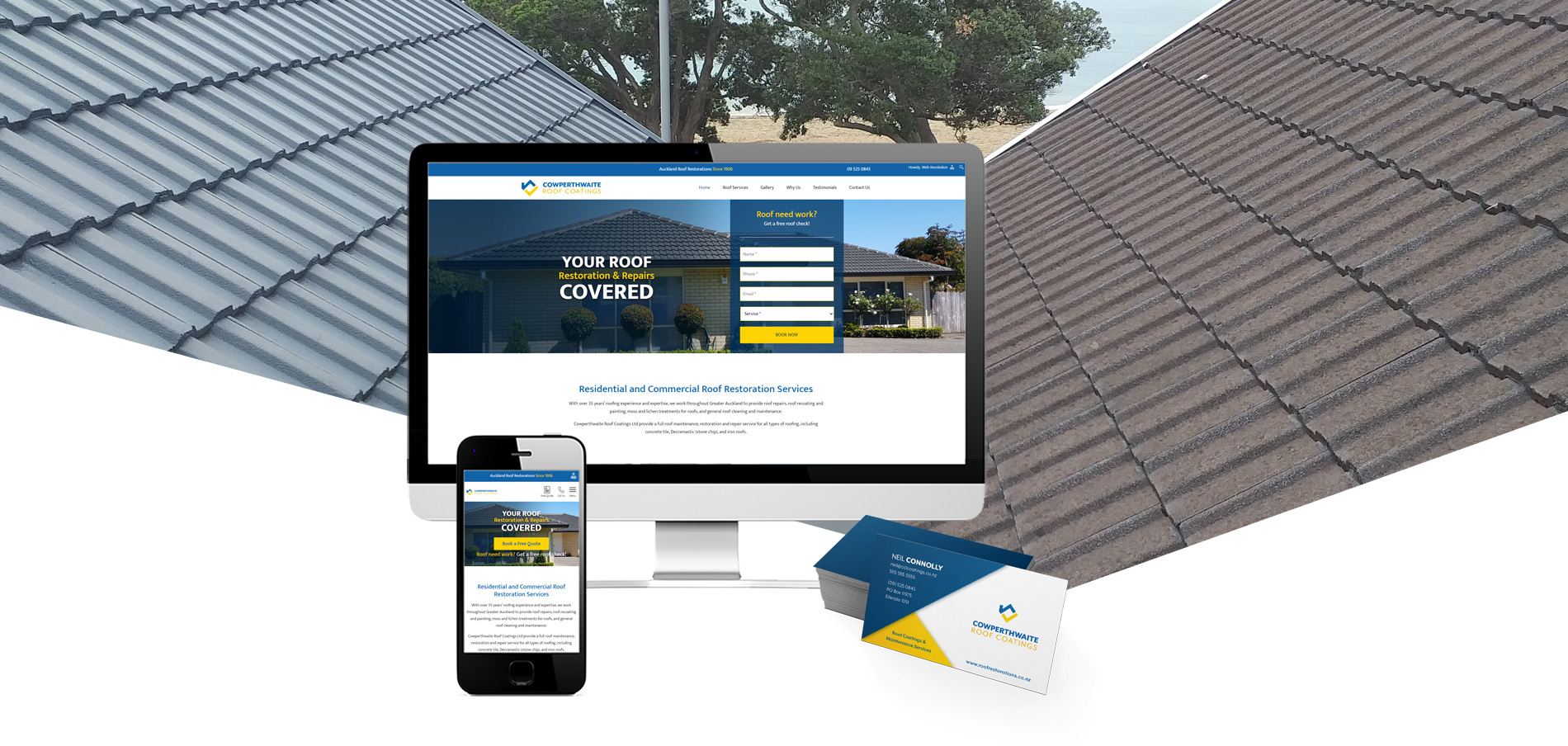
Cowperthwaite Roof Coatings bring old, leaky and damaged roofs back to life! Unfortunately they had a slow website that wasn’t performing, so Web Revolution was brought in to bring it up to speed.
Through the website design process, the client discovered that they would also like to re-brand. Web Revolution was asked to also design a modern new logo and business cards to match the updated website.
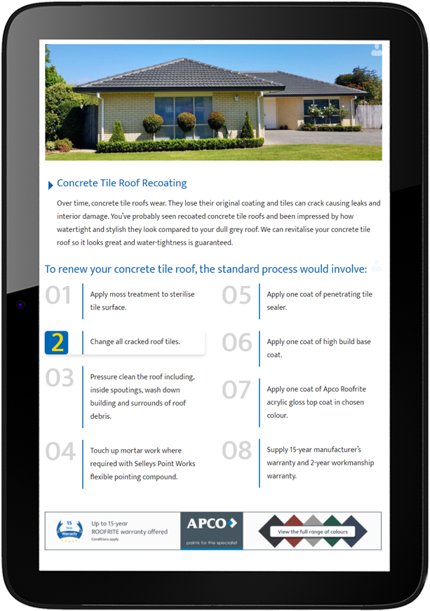
Showcasing the full extent of services
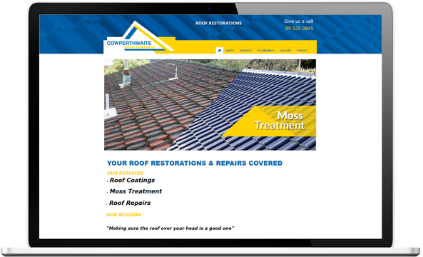
The old website for Cowperthwaite Roof Coatings was not only slow, but had broken features, didn’t showcase the full extent of the work that they do and was missing some of the basic SEO functionality required to help them rank well for their target keywords.
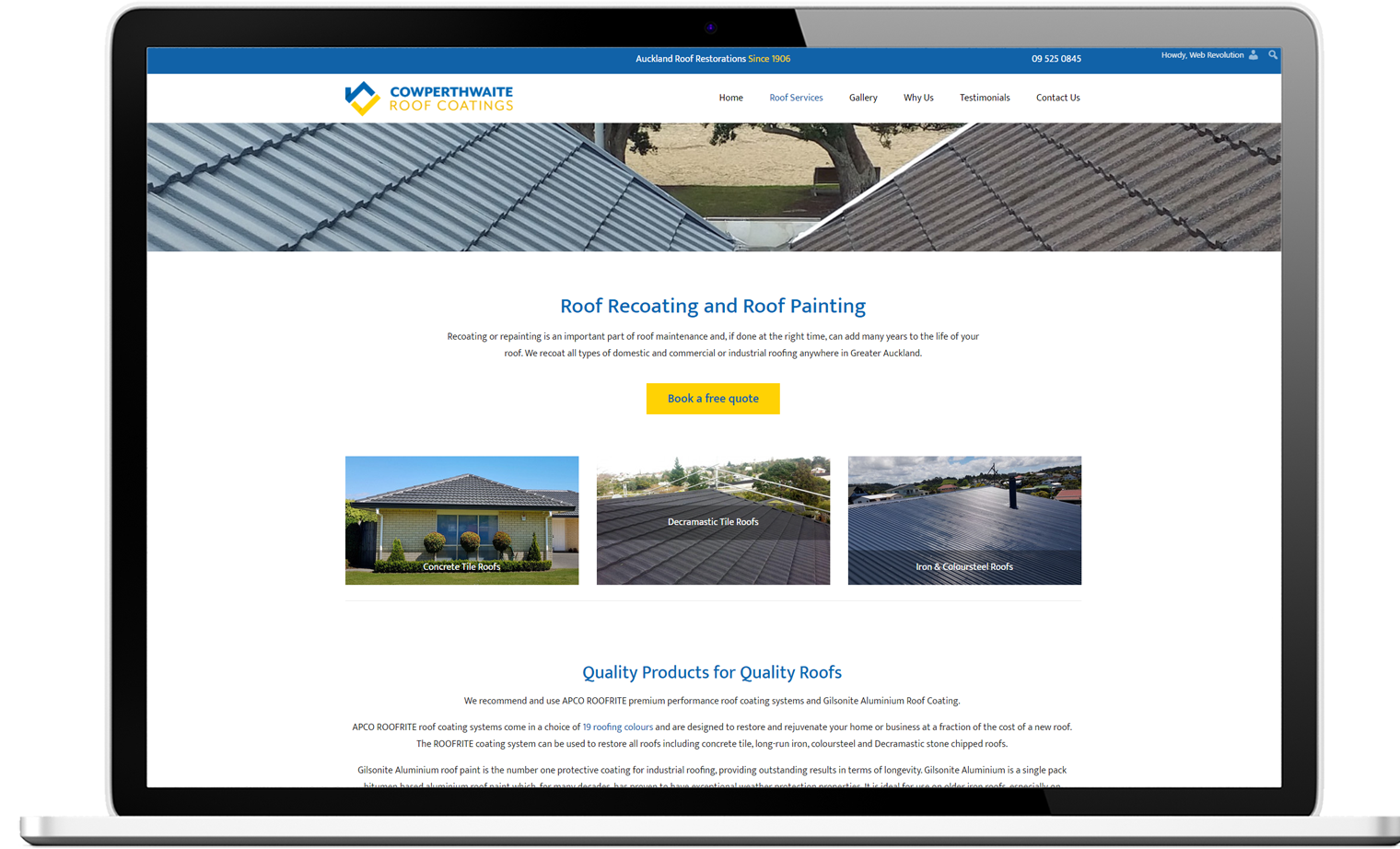
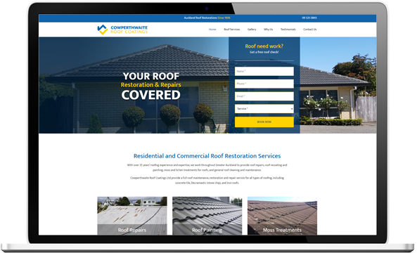
The new website extends the text and photos to expand the offering to iron and steel as well as concrete tile roofs. By including photos of the different types of roofs that they coat and repair on the homepage, it makes this clear to the visitor. Unique selling points help promote the services and prominent call to actions and a contact email address encourage interaction. By moving hosting and DNS to Web Revolution, page loading time has been cut almost in half. Goal tracking has been set up so that we can keep track of the leads generated by the new website.
WEBSITE BEFORE:
WEBSITE AFTER:
A powerful iconic logo
Once the website design was approved and development was complete, the client revealed that he never liked the company logo. The brief was to keep the colours but modernise the look.
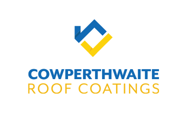
We kept the original colour palette and the same geometric style to maintain brand recognition. At the same time, we consolidated the roof concept into a strong uniquely identifiable graphic that can be isolated and used independently from the text. Paired with a bold sans serif font and the original bright complimentary colours, Cowperthwaite Roof Coatings now have a powerful iconic logo.
LOGO BEFORE:
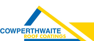
LOGO AFTER:

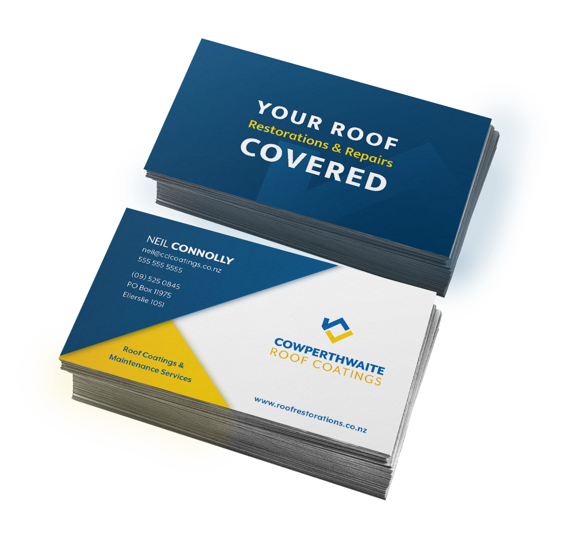
Brand continuity
To maintain continuity of the brand assets, new business cards were also designed. In keeping with the angular style of the new logo, solid geometric shapes are used as a layered background to contain contact details and other essential information. This results in a bold first impression.
